The challenge
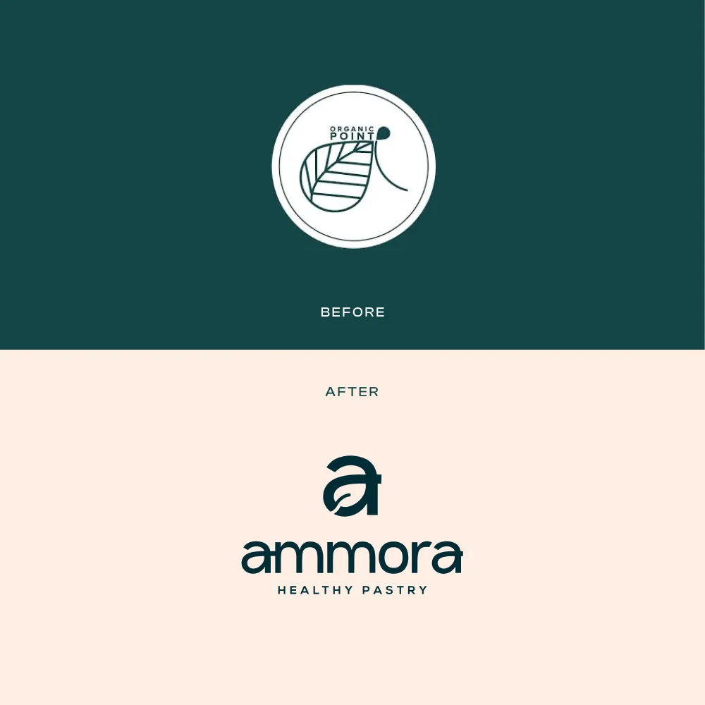
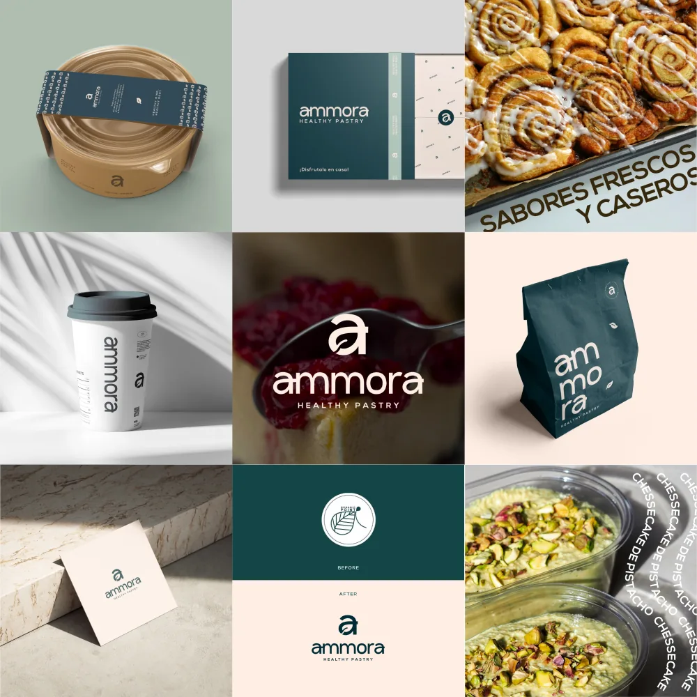
The product could win people over in person, but on a phone the brand had to do the work of sight, smell and taste. The previous mark became hard to read at small sizes and its visual language was difficult to repeat consistently.
Objectives
- Give the business a distinctive name.
- Make the logo legible from an app icon to a shopfront.
- Express freshness without falling into familiar health-food clichés.
- Keep the product itself at the centre of the story.
The solution
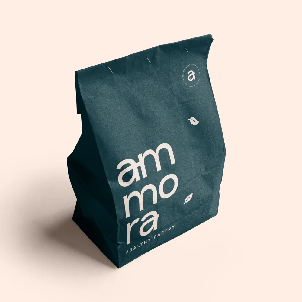
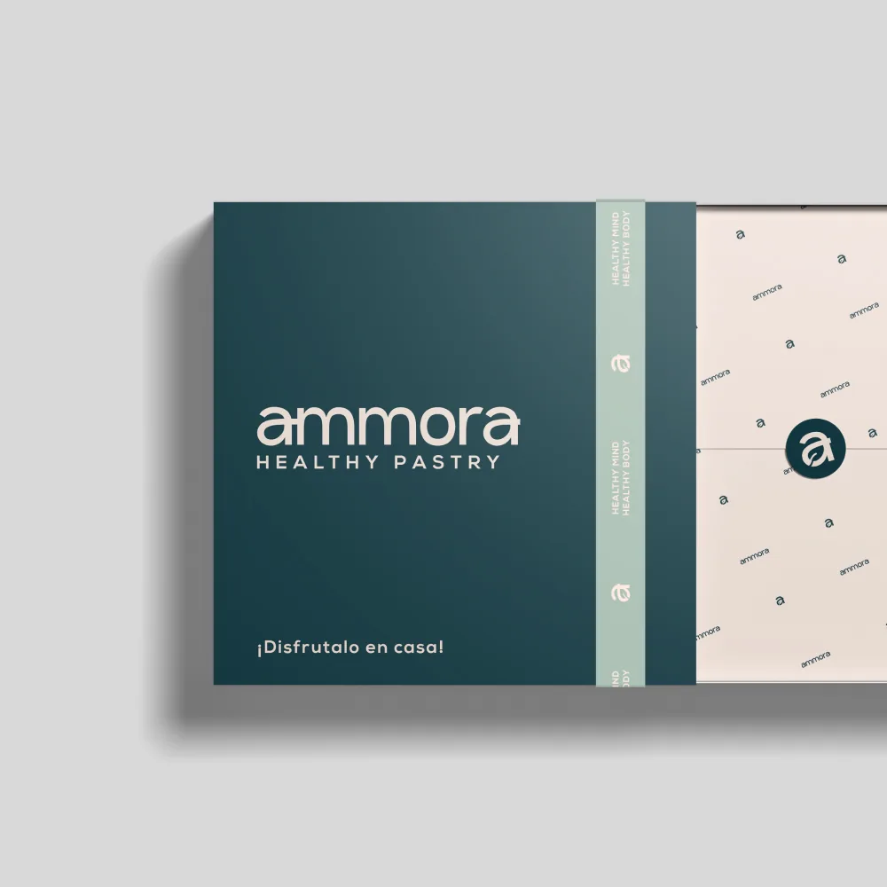
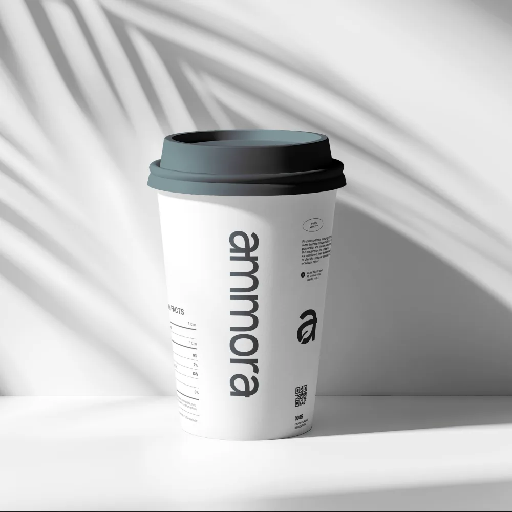
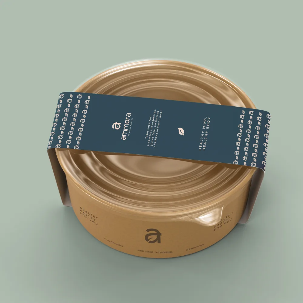
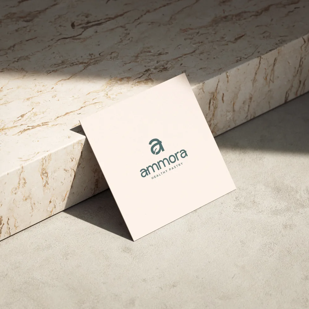
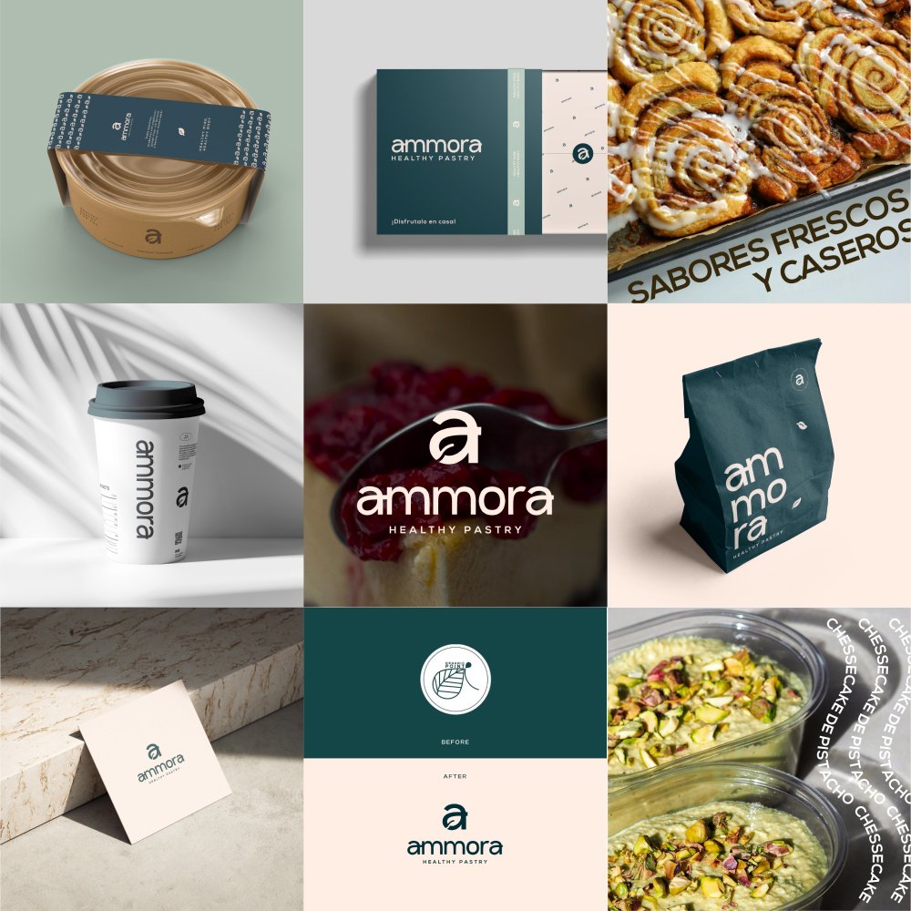
Ammora is short, memorable and suggestive rather than descriptive. I made the name itself the logo, with a soft lowercase wordmark that holds up at small sizes. The leaf is integrated into the initial letter instead of competing with it.
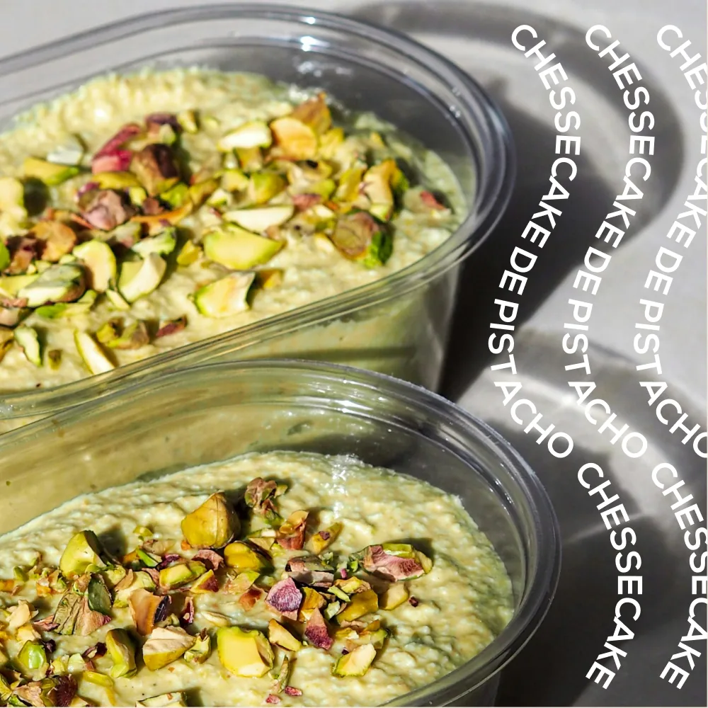
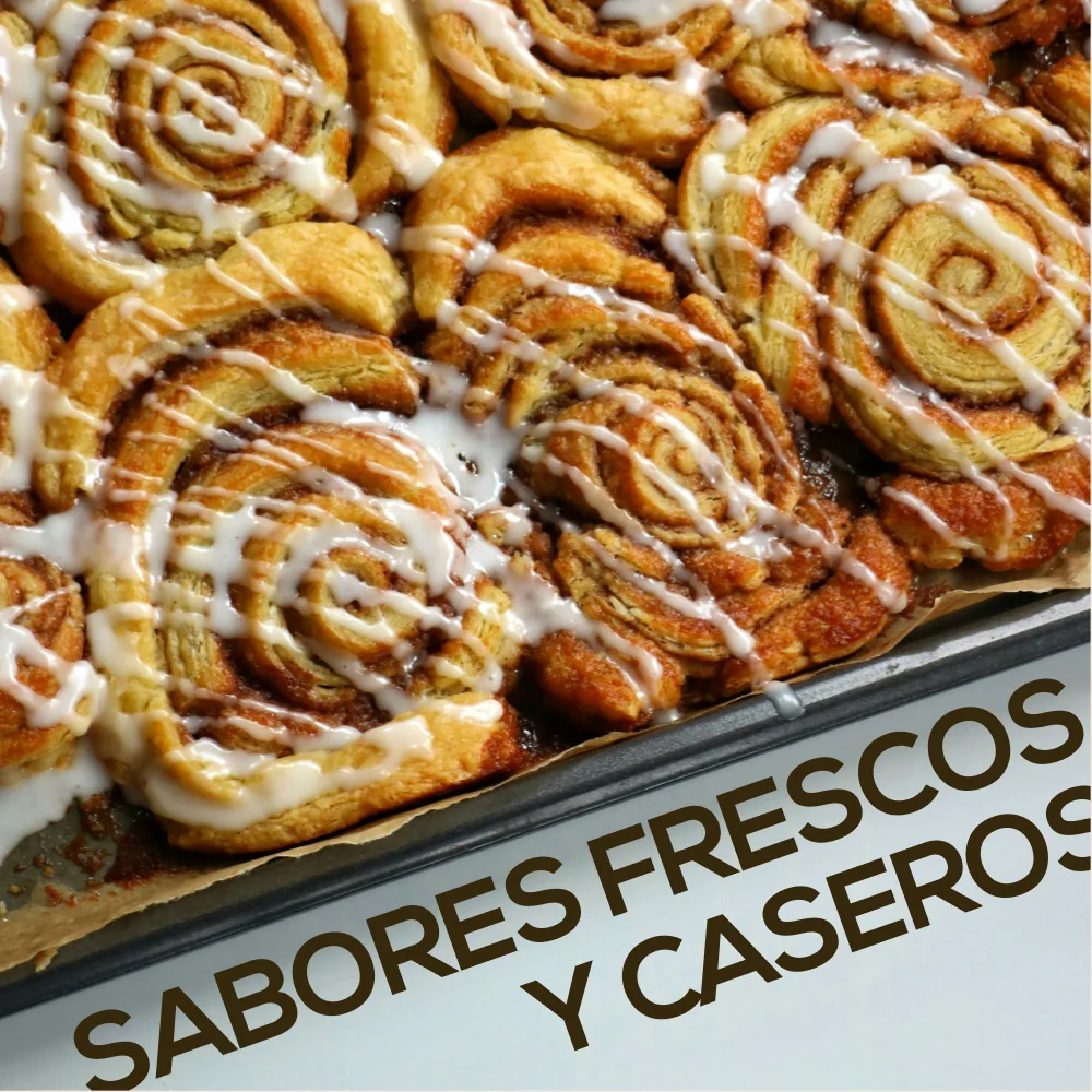
A deep petrol green works as a quiet backdrop for the product. The same wordmark and colour band carry across boxes, bags, cups and tubs. Social templates give the team a consistent layout they can update by changing the photo and copy.